


The starting point for this project came from the German multimedia artist Katja Windau, from the wall installation Die Zelle des Piet M (“The Cell of Piet M.”) Following the project, she took detailed photos, which she abstracted, mirrored and partially re-coloured on the computer. It was these pieces that really caught my attention.
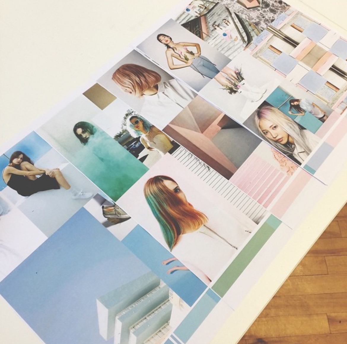
From this original starting point I began to build up the theme, using these pieces by Katja as the base for the colour palette I began to expand the imagery.
As well as being inspired by Katja Windau’s work, I came across the German fine-art photographer, Wolfgang Tillmans. I was drawn to his work by the colour and abstract lines. Tillmans has applied his undisputed technical skills and mastery of colour toward a new interest in abstraction: the loose, improvisational mode that characterized his magazine work, now harnessed to a larger ambition, has also resulted in a deeper emotional impact that suffuses all of his efforts. The first piece of his work that interested me was Starstruck #3 which is an abstract photograph composed of thin, jittery back lines across a pink colour field.
From this research the theme began to build into a trend for Autumn/Winter 2016, for the womenswear fashion market.
A sugar pop palette but with harsh dark elements from the abstract imagery. There’s a mixer of different marks and shapes, I am gaining inspiration from for my fabric and visual exploration.
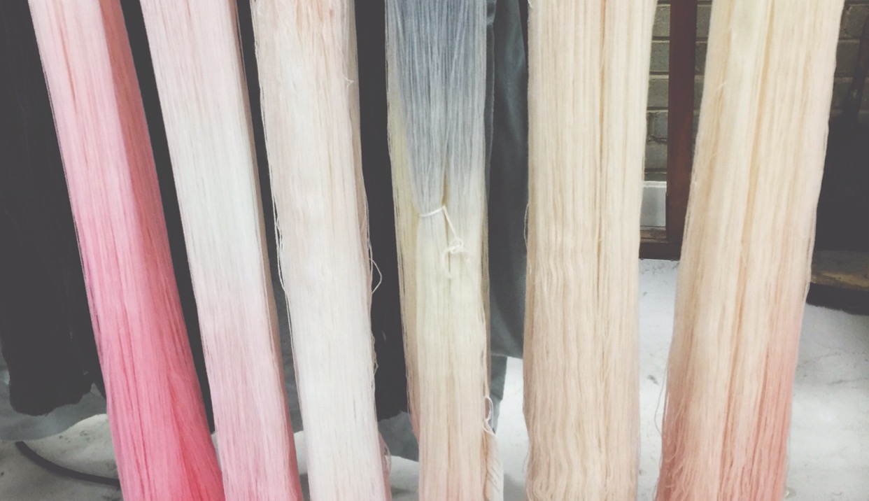
The key colours in the story are all in pastel shades mainly from looking at the imagery of pastel hair as well as the artist pieces, but looking at various different tones in the colours to give it a high-end, sophisticated feel. Adding harsh dark blacks and greys will help to break up the palette making it suitable for Autumn/Winter since this palette would normally be associated to Spring/Summer.
Taking my own photographs to abstract and pixelate has been a great source of inspiration to develop the trend from the original starting point, this has developed the trend and colour palette.
Designing for the womenswear fashion designer market. Using high quality yarns to produce high quality fashion fabrics will sit the collection at the higher end of the market. Brands such as ESK, Sportmax and Acne will be my competition, because of where I see this collection sitting in the market.
Crossing over the market to the high-end high street depending on the fibres in each knitted sample (e.g. lambswool rather then cashmere). Brands such as COS, Whistles, & Other Stories are the competition at this end in the market. At the very top end of the market brands such as Missoni, Miu Miu and Chloe are great inspiration.
The aim of the project is to explore colour, different shades and tones, working to my own trend, Pastel Strands, for Autumn/Winter 2016. Designing a collection of high quality ‘Made in Britain’ knitted samples for the designer market, which explores texture, colour and structure through a range of knitting machines. Using space dyeing, jacquard, transferring and intarsia. Space dyeing will be used to not only explore colour but also to create patterning through the dyeing process in knitted fabrics. Working with high quality fibres such as Cashmere, Merino, and Lambswool from companies such as Todd & Duncan and Z.Hinchliffe. The aim is to focus the trend and produce innovation knitted fabrics through the use of a range of techniques.
C. x
